
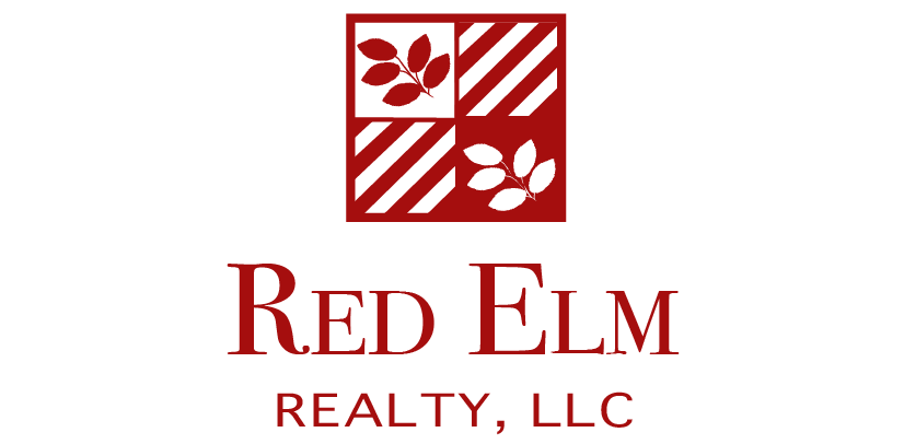
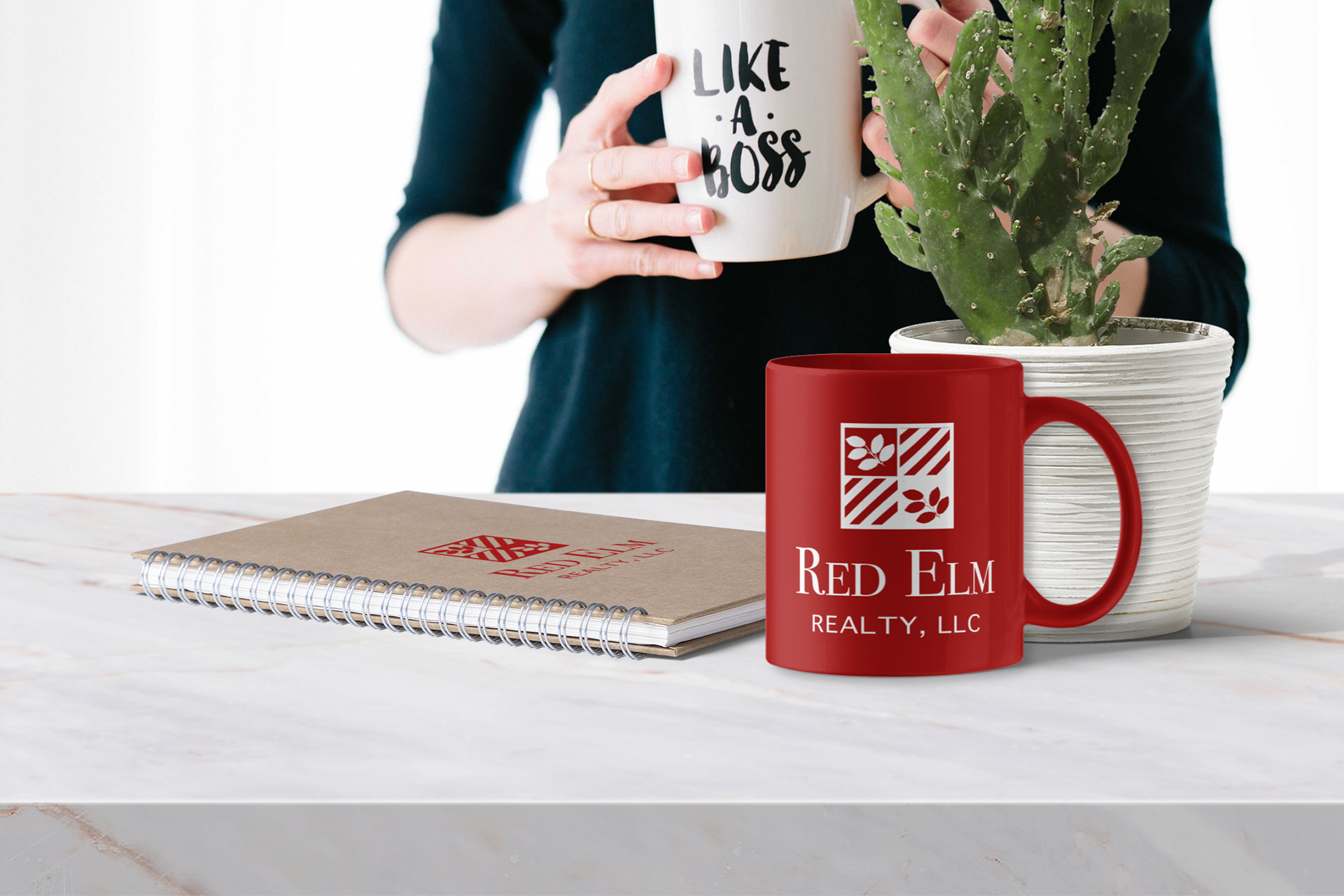
RED ELM
Realty Company Brand Identity
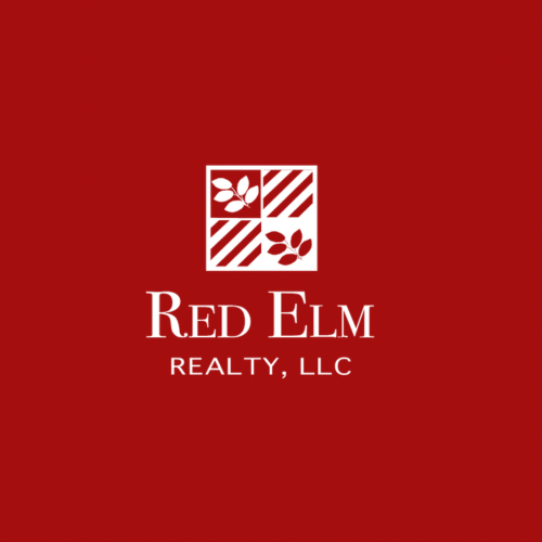
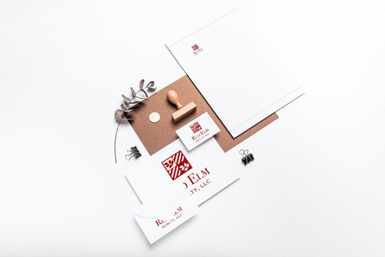
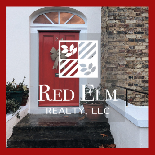
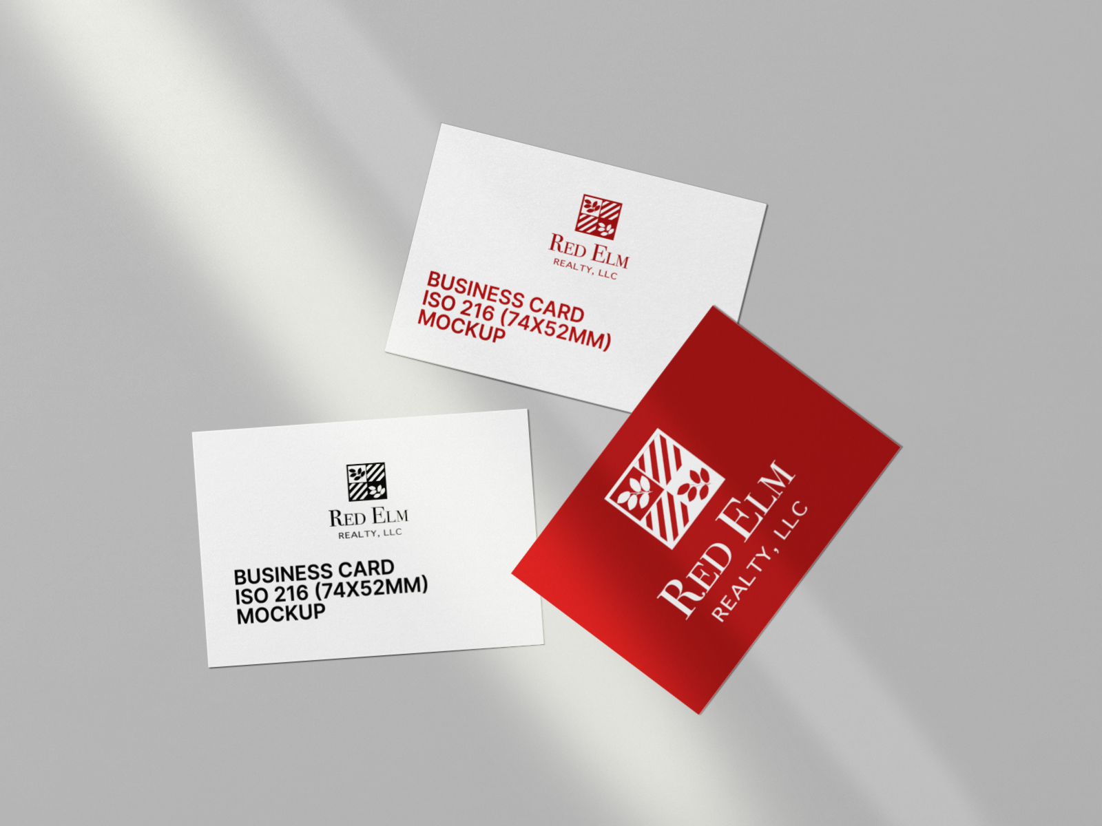
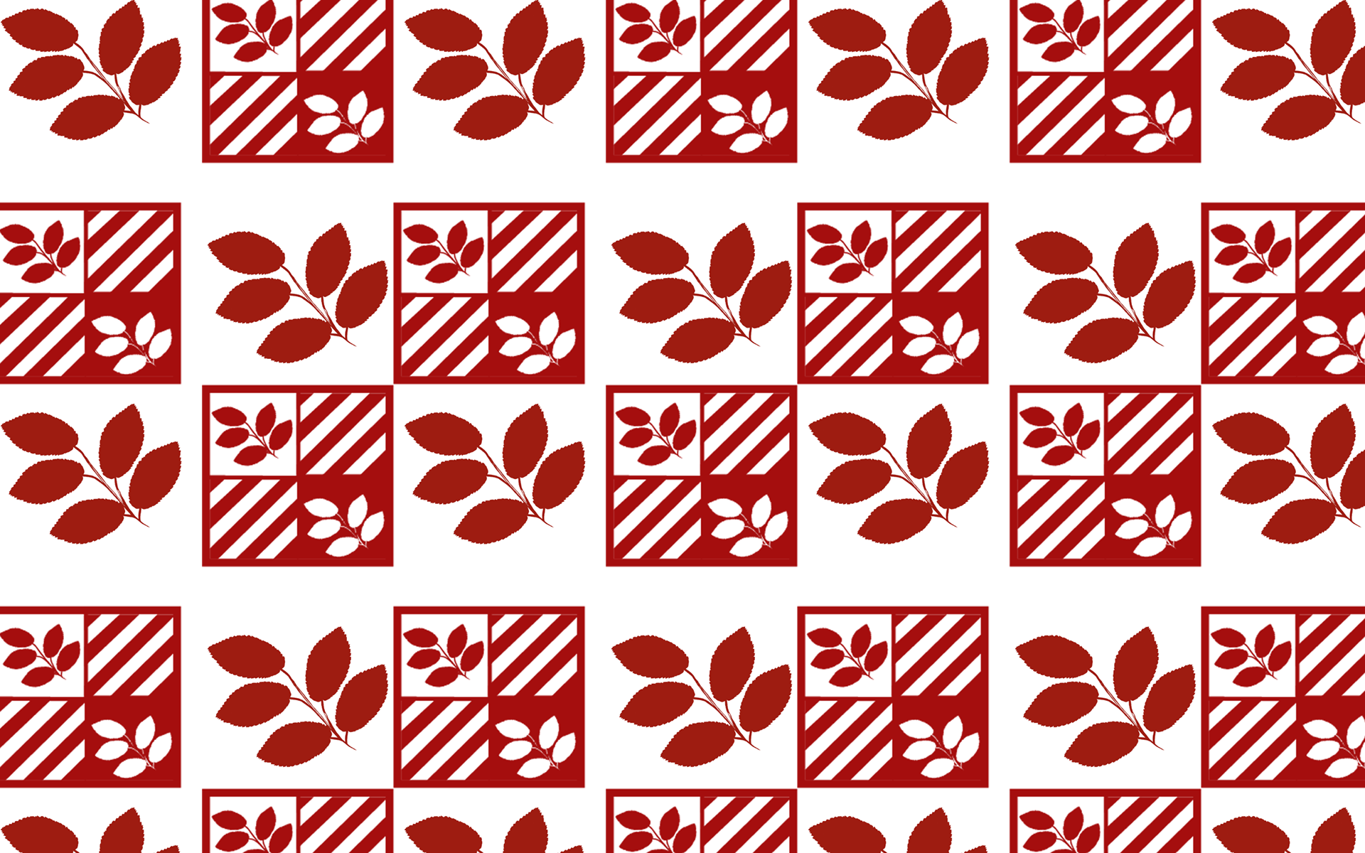
Pattern for Realty Company
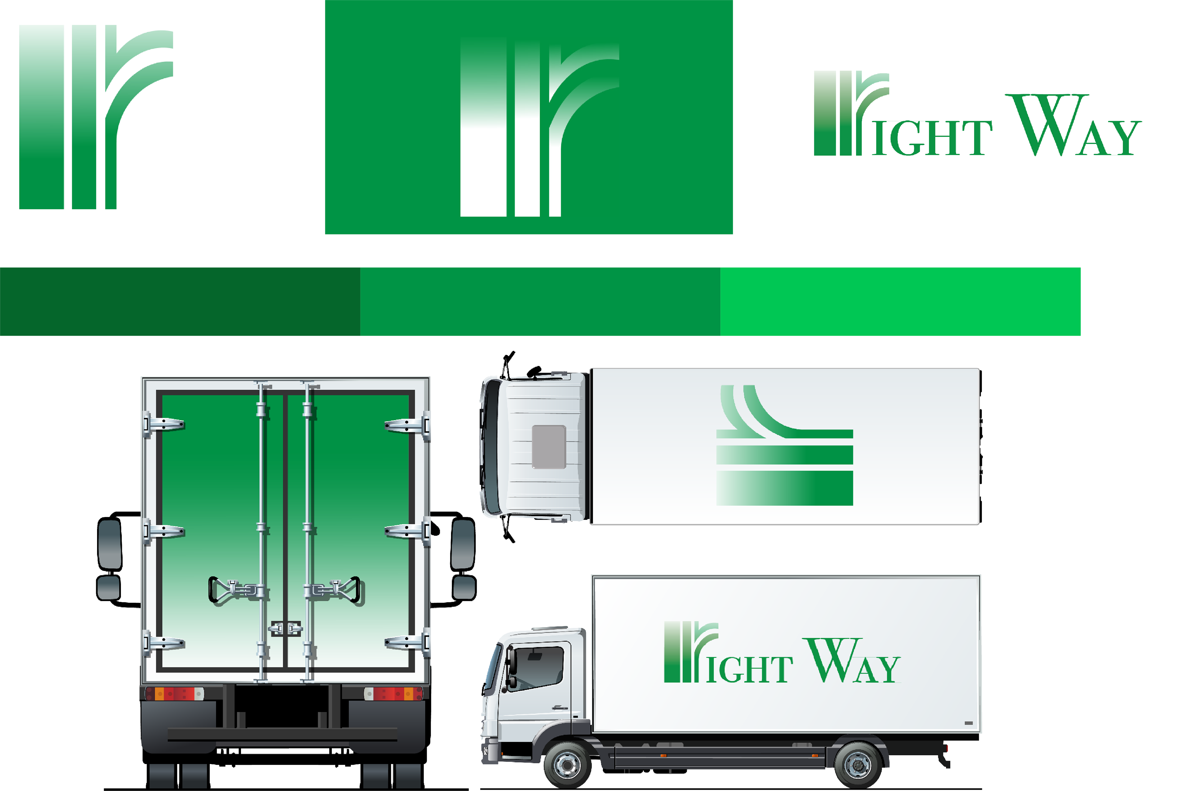
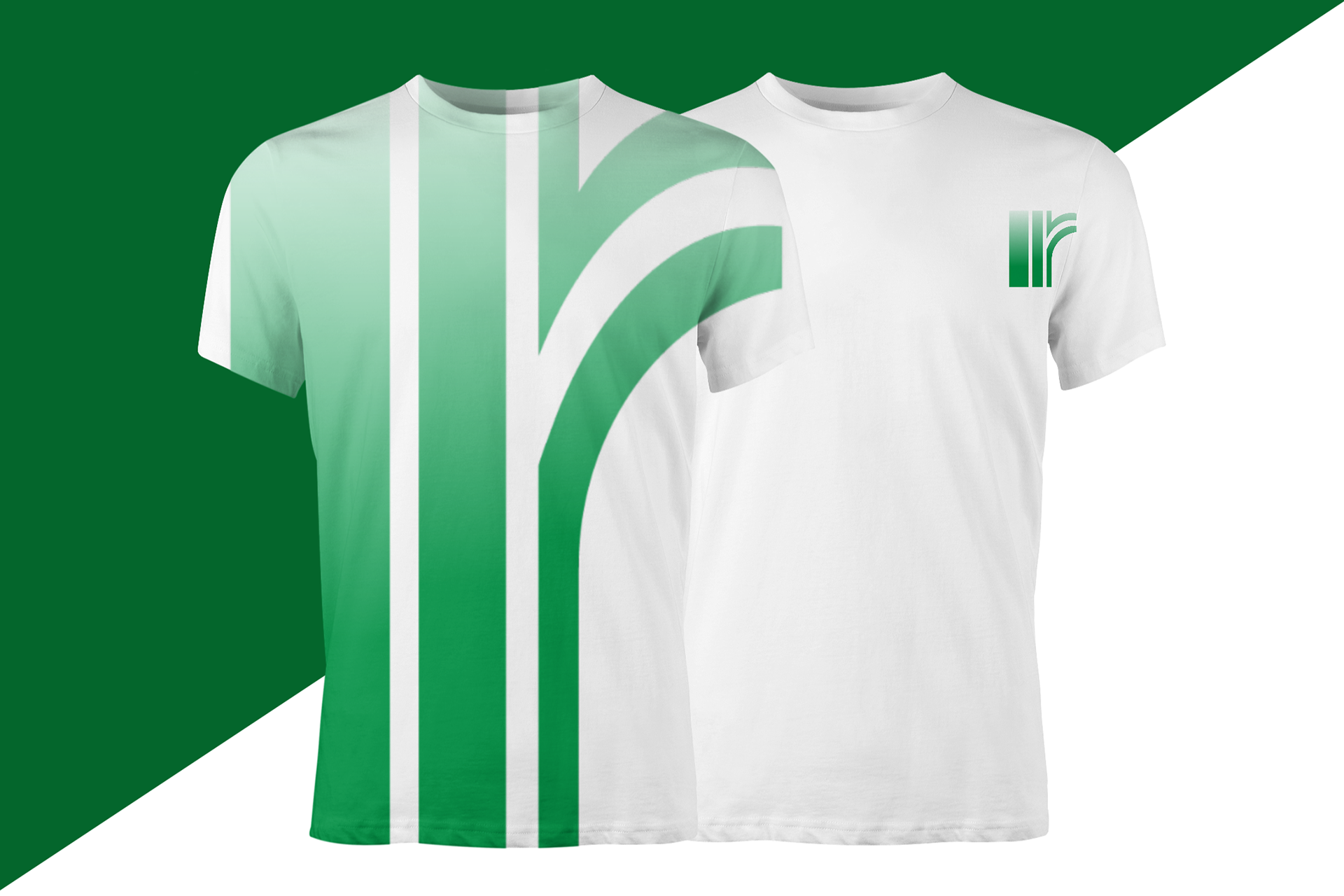
RIGHT WAY
Logistics and Distribution Design Concept
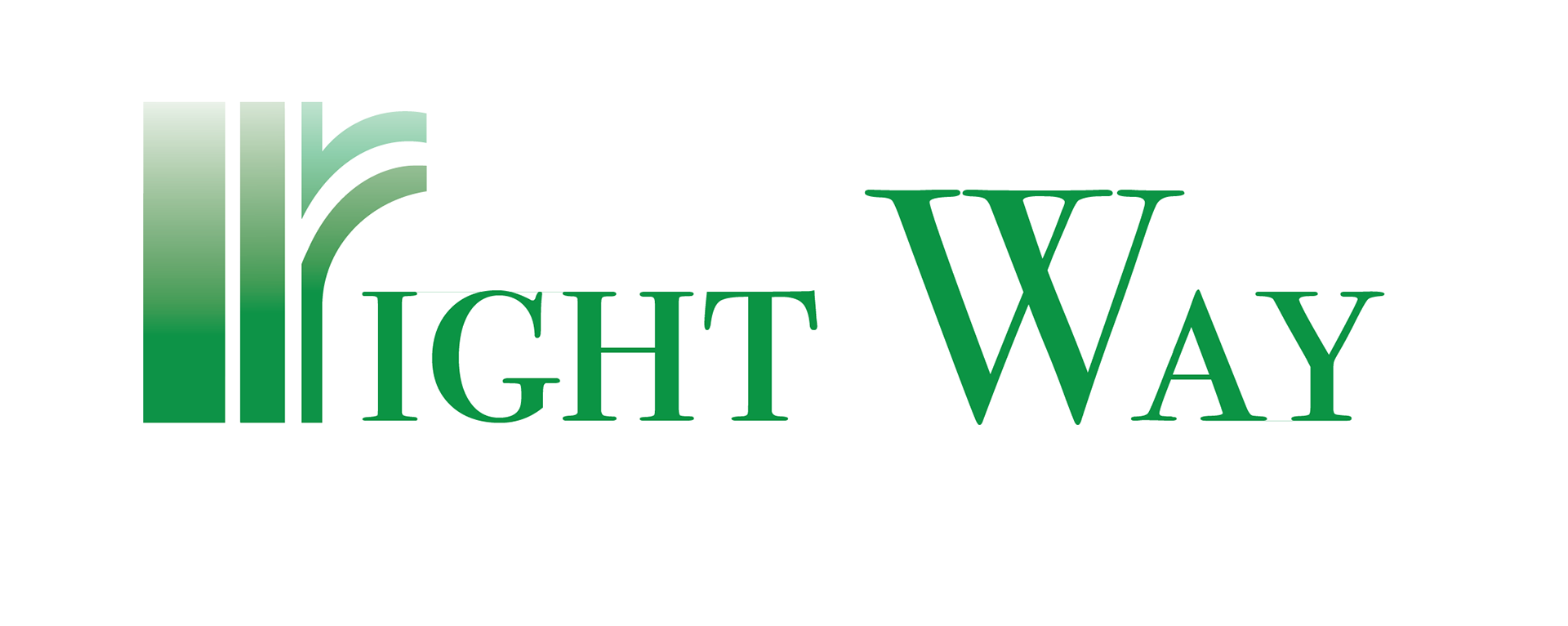
Right Way, a start up logisitics and distribution company, requested a green gradient logo to be displayed on the side of their loading vehicles. In addition to logo design, industry research was conducted and a brand strategy to discover methods to position them in the logistical services market. A simple and minimalistic approach to the design was taken, as many other logistic service companies who worked with similar clients to Right Way was utlized. Not only was green the favorite color of the owner, green was selected to emphazie the company’s objective to use clean fuels to propel sustaianabiltiy efforts. Additionally, Right Way promotes themselves as a safe and stable source of logisitics services their clients can depend on.
BAKARUS CAPITAL INVESTMENTS